Avondale Dental Studio
When my wife decided to open a dental office in our neighborhood there was no way I wasn’t going to be her designer. I helped design and build the brand, the website, and anything else design related.
What Do You Call It?
As we started this journey the first thing we needed to decide was what were we going to call this new office. My wife, Lauren, knew she wanted it to be a “Dental Studio,” but beyond that we were at a loss. After workshopping it for a while, exploring puns, variations of smile, or some other mouth related word, we realized that none of those would make us stand out. The goal of this office wasn’t to build a multi-office dental behemoth. Instead it was to be a neighborhood dental office that could serve its residents. That neighborhood is Avondale on the northwest side of Chicago.
We realized that we didn’t need to be punny or push a clever name. If we were going to be a neighborhood dental studio, we should reflect that in our name. We landed on a name that did just that, Avondale Dental Studio.
The Smile
The next step was to decide on a direction for the logo. In doing market research I realized that quite a few offices were keen on showing teeth. While teeth are a main component of what a dentist office does we wanted to highlight the smile. A smile is hopefully the end result of good dental care. We want our patients to have the confidence to smile because of the work we do to help their oral health. It just so happened that the letterform of the capital A melded nicely with that wide smile.
Building an Online Presence
Now that we had a logo we needed to build a presence online so we could start letting the neighborhood know there was a new dentist in the neighborhood. The name “Avondale Dental Studio” was an important part of that. When someone searches for a dentist in Avondale, there’s a better chance of a dental practice rising to the top of the search results with Avondale in the name than without.
We wanted to have a modern dental practice, and a big part of that was the website. We wanted our patients to be able to interact with us primarily via our site. This meant not just having a website with pictures and flowery words. We wanted to have everything a potential patient might need on our site. This meant sitting down to discuss what was important in a patient making their decision on where to go for their dental care.
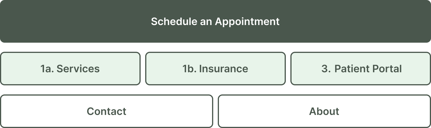
Card Sorting Results
We sat down to do a quasi card sorting exercise. We sorted the potential pages into different categories: most important, important, less important, and not needed on the site. This exercise helped us determine the design and order of the navigation. On top of that it got us to talking about what should be on each of those pages.
SEO vs Usefulness
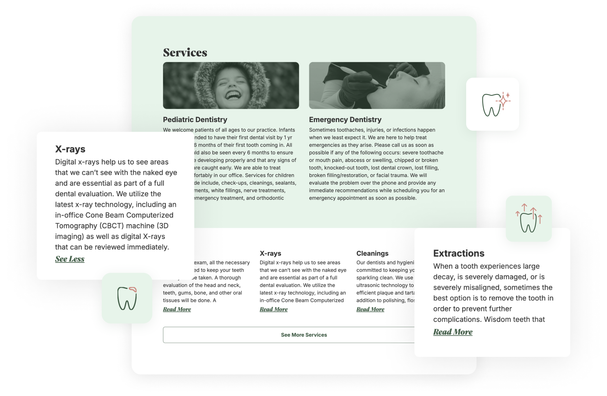
The discussion of what should be on a page led us to talking about the services page. This page would be one of the most useful pages for our patients because it tells them how we can help them. It would also be one of the most useful pages for SEO purposes due to the amount of words on this page in comparison to the rest.
Lauren came up with 15 different services that she wanted to have on the services page. Each of those services had a paragraph description to give potential patients an understanding of what we can do for them. Unfortunately, displaying all of that on a page would create a wall of text, which makes the page hard to parse and use for a potential patient. However, all that text is very useful for SEO and page ranking. We needed a way to make the user experience parseable, but also satisfy the SEO needs.
Services Page
We realized that we could surface the services Lauren thought would be the most relevant for her patients and hide the rest. We hid most of the services behind a “See More Services” button as well as the full descriptions behind a “Read More” link. Patients could access all of those services with a few clicks, but also wouldn’t be shown a wall of text as soon as they load the services page. We also realized hiding some of the services and descriptions still allowed the major search engines to crawl them. This meant that hiding them didn’t harm our SEO.
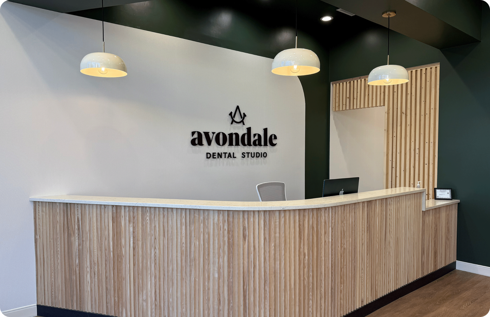
The Brand and The Space
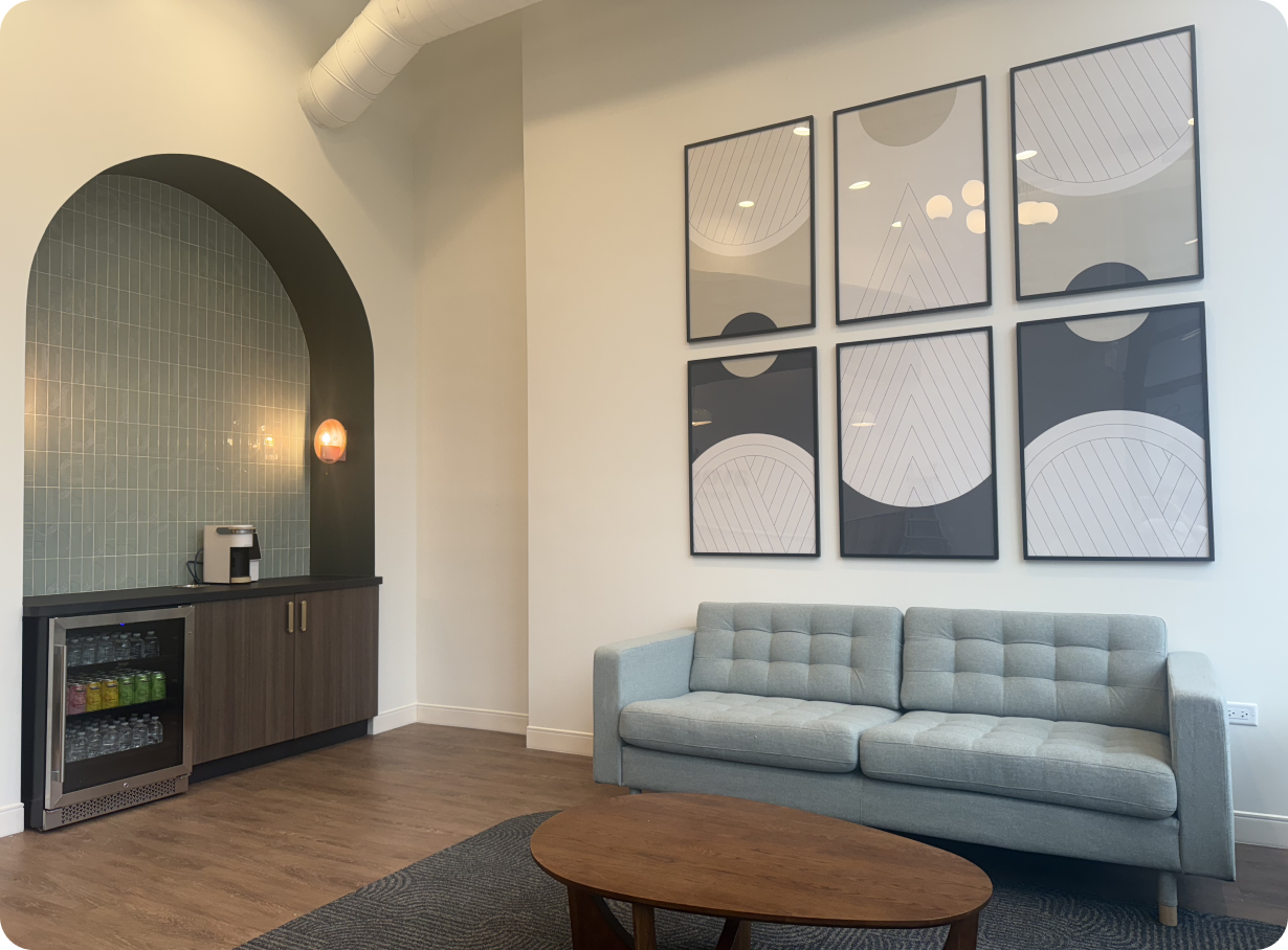
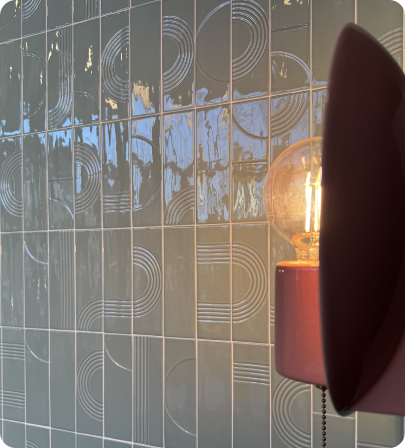
Every decision with the logo, brand assets, and the interior space was meticulously chosen to be in harmony with each other. The smile is reflected in different areas throughout the office, specifically in the curved reception desk and the arch above the hospitality station.
The Launch
Avondale Dental Studio opened on December 2nd, 2024 and has had a successful few months. We are consistently getting patients on the schedule and have been enthusiastic about their experience. Only part of that is our digital footprint, while that helps introduce our patients to the office, it is the welcoming space and friendly staff that helps complete that experience. Each part of the whole feeds the other to make it a great experience for the patients.